AudienceData
Adserver
Best Practices
Do's and dont's when using AudienceData
How to document the accuracy?
Why introduce segments with different affinities?
Using targeting with the right conditioning
DSP
How to access data AudienceData segments in Adform
How to find AudienceData in MediaMath DMP
How to find segments in BidTheatre
How to find segments in Display & Video 360
Data Introduction
Available Segments
Existing integrations
Methodology and precision
The distinction between campaign impression profile and impressions in target group
What is deterministic data?
What is probabilistic data?
Publisher
Accessing targeted data with DFP Audience sync
AdForm publisher integration instructions
How to find data usage information in Google 360 for Publishers former DFP
How to report on AudienceProject segment usage in DFP
Inventory available for realtime targeting in DFP
Lotame integration
Sending targeting key values to AdManager
Troubleshooting
AudienceHub
How to create your first audience
How to create your first seed
Case 1: Selecting a customer file
Case 2: Selecting an Amazon S3 file
Case 3: Selecting survey data from UserReport
Creating a seed
Insights reports
What is AudienceHub?
The new generation of AudienceReport
API Documentation
API Best Practices
How do I use the AudienceReport Next API?
Understanding the API documentation
What is an API?
Where do I find the API key?
Account Management
Account Types
Agencies: managing user access for connected accounts
How to add new clients
How to connect an Agency account to a Premium client account and vice versa
How to disconnect accounts
How to manage user accounts
User roles
What is the 2-step verification and how does it work?
Integrations
Adform
Amazon Ads
CTV and Addressable TV
Campaign Manager
DV360
Facebook/Meta
Semi-Automated integrations
TechEdge Integration
YouTube
Measurement Methodology
Pixel Implementation
Getting Started with Pixels
How do URL-Parameters work?
How to add parameters to AudienceReport pixel
How to check if your pixel is firing?
How to create a pixel?
SSL - Compliance
The GDPR parameters
What is a CACHE-Buster and why do we need it?
What is a tracking pixel?
What is the purpose of a t-code?
Setting up Pixels
Pricing
Reports
Creating and Sharing reports
How to add and export tracking pixels to your reporting items
How to add custom report items
How to duplicate a report
How to export your report
How to share your report with your client
How to understand your report
How to understand your report - Dashboard
How to understand your report - Delivery
How to understand your report - Funnel
How to understand your report - Profile
How to understand your report - Reach
How to use an exported pixel
Getting Started with Reports
The original AudienceReport
Addressable TV
Activating Addressable TV measurement
Available Addressable TV device types
How Addressable TV is measured
How to get the Addressable TV measurement tool in AudienceReport
Impact on sample size and frequency
Sharing Addressable TV measurement numbers with TechEdge
What is Addressable TV?
Adserver Implementation
Ad Tech
Adserver - Adform
Adserver - VideoPlaza
Atlas
Double Click DCM Adserver
Emediate
Extented Sizmek Asia-guide
How to implement creative wrapper in Ad Manager
Programmatic Publisher Ad Server - Adform PPAS
Setting-up video measurement in Google Ad Manager
Sizmek Ad Suite Tracking
Sizmek/MediaMind guide
Tracking using JavaScript
Implementing AudienceReport tracking pixels in Webspectators
Brand Lift Studies
Cache-buster
Is my cache-buster working?
What is a cache-buster?
Which cache buster shall I use for my ad server?
Why do we need a cache-buster?
Creating Projects
Adding tracking points / pixels to your project
Applying filters to your data
Change your target group or report period
Creating your first project
Duplicating campaigns
How to merge projects
How your data will change when applying filters
Custom Segments
Activating your Customer Segments 3.0
Available Custom Segments
Custom Segments 3.0
Custom Segments and Sample Size
Reach, Coverage and Segments Availability
What are Custom Segments?
Event Tracking
Adding tracking points / pixels with event tracking to your project
Event tracking in various adservers
Implementing click trackers
In-app tracking
In-view tracking of inlined content
Understanding Event Tracking
What is Event Tracking?
Integrated Report
Connect your Facebook Business Manager account to AudienceReport
Connect your Google Ads account to AudienceReport
Connect your Google Display & Video 360 account to AudienceReport
How are data integrated?
How to create an Integrated Report
To-do list before creating an Integrated Report
Understanding your Integrated Report
What is an Integrated Report?
Integrations
Adform integration set-up
Automatic tracking of DFP campaigns
Google Campaign Manager Integration
Integrate AudienceReport and Techedge AxM (AdvantEdge Cross Media)
Intercept
Pixel implementation
Quality
How Transparency is measured
How Viewability is measured
How the Overall Quality Score is calculated
Viewability tracking using AudienceReport measurement script
What is Quality?
What is a good Quality score?
What is a hidden referrer or a generic referrer?
What is the difference between no referrer and other referrers (in the tracking point violations table)?
When is a tracking point considered to be violating Geo Compliance/Transparency/Viewability?
Why can’t I drill down on some countries to see in which regions my impressions are loaded?
Why is my overall score not that bad when almost all my impressions are of low quality?
Why is there a discrepancy between the impression count in the Quality tab and the rest of the report while my campaign is running?
Will my viewability score of 0.0 affect the overall Quality score if I didn’t implement in-view tracking?
Reports
Customized PDF reports
Deeper Insights with Campaign Audience Measurement
Exporting your report
How to search for your project
Introducing the common affinity profile
Managing your projects with labels
Sample sizes
Tired of clicks and imps?
Understanding your project
Technical Questions
Account Administration
Ad blocking
Can I change the phone number I chose for the two-step verification process?
Checking SSL-Compliance
General Troubleshooting
Getting started with AudienceReport API
How do URL-parameters work?
How often will I be asked to log in through the two-step verification process?
How to track traffic by device type
If you accidentally delete pixels from your project
The procedure to enable the two-step verification
What if I lose my phone and cannot access my account?
Tracking Pixels
Upgrade to the new generation of AudienceReport
AudienceReport Upgrade FAQ
Comparing the original and the new generation of AudienceReport
How to import data from the original AudienceReport
UserReport
Installing UserReport and setting up your media sections
Defining your website in the media section
General Account Information
Installing UserReport on your website or app
Adding own user ID to UserReport
Configure Google Tag Manager to resolve media dynamically
Configuring media/section through snippet
Install UserReport script with Google Tag Manager
Installing UserReport SDK to Android Application
Installing UserReport SDK to iOS application
Installing UserReport script on your website
Kits
General Information
Reach and Coverage of Custom Segments
Target Audience verified by Kits
The technology behind Kits
What are Kits?
Getting started
Troubleshooting
Working with Kits
The feedback widget
Activate the Feedback widget
Adding context information to ideas and bugs
Customize Feedback widget buttons and links
Customize color, text and position of the Feedback widget
Disabling the Feedback widget on specific devices
Get direct link to the Feedback widget or manually display it
How to activate your Feedback widget
How to change the status of an idea or add a comment
How to disable the "report a bug" feature
Is the Feedback Forum available in my language?
Pre-populating username and email
What is the Feedback widget?
The feedback report
The survey widget
Activate Email Collect
Activate Net Promoter Score ®
Activate the Survey widget and create your questions
Chained questions and how they work
Controlling invitation frequency when using UserReport script and Google Tag Manager
How many questions can be added?
How many surveys answers do I need?
How to add questions to your survey
How to customise you survey widget
How to deactivate and delete your survey questions
How to show or hide results from users
Is UserReport 100% free?
Is the UserReport survey widget available in my language?
Managing invitation rules through Ad-server
Preview your survey
Respecting the user
User invitation to UserReport survey and the quarantine system
Who pays for the prizes in the survey?
Will UserReport slow down my website? Is it affected by popup blockers?
The Google Analytics Integration
The survey reports
Accessing Newsletter signups using API
- All Categories
- The new generation of AudienceReport
- Reports
- Creating and Sharing reports
- How to understand your report - Reach
How to understand your report - Reach

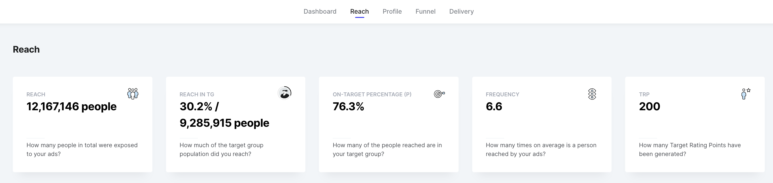
The Reach section shows a detailed overview of your campaign reach, frequency, TRP, and other metrics for your campaign in the determined timeframe.
The report tiles show the overall reach results of the campaign
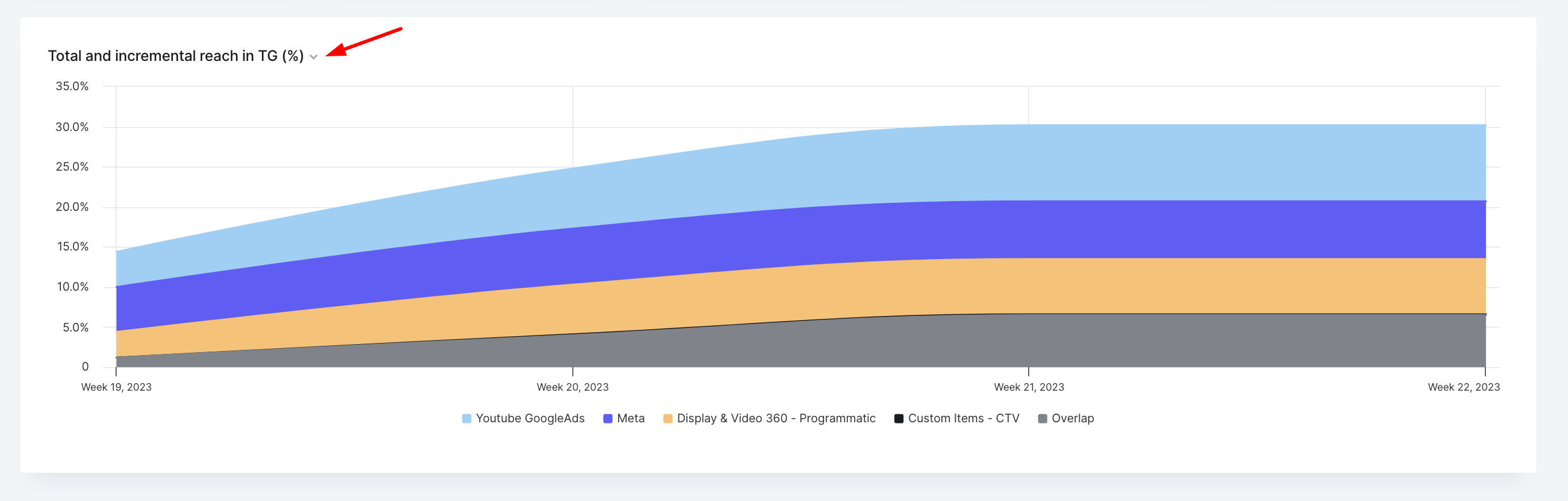
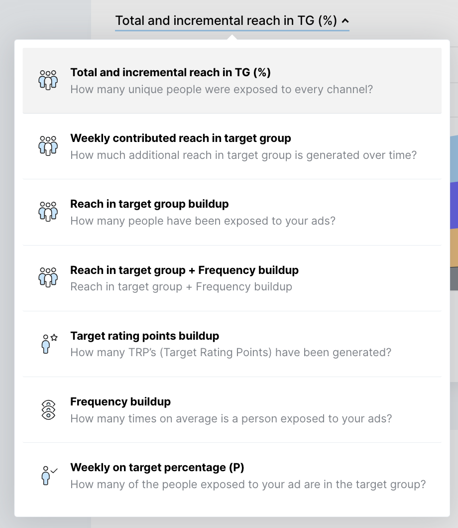
On the first graph, you can customize the visualization of your results, for example, you can visualize them by Incremental reach in TG, Reach in TG, and so on. To do this, you need to click on the dropdown arrow, in the upper left corner of the graph, then select how you would like to display the results
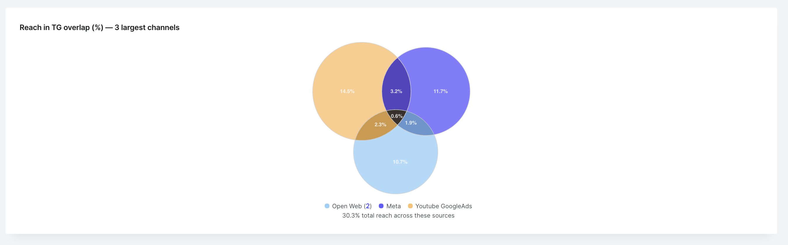
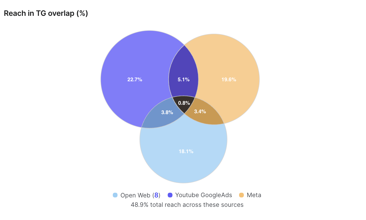
The next graph represents the Reach in TG overlap (%). On this Venn diagram, we show the 3 biggest channels (referring to Reach) and their overlap - the overlap between every 2 channels and the overall overlap between the 3 channels
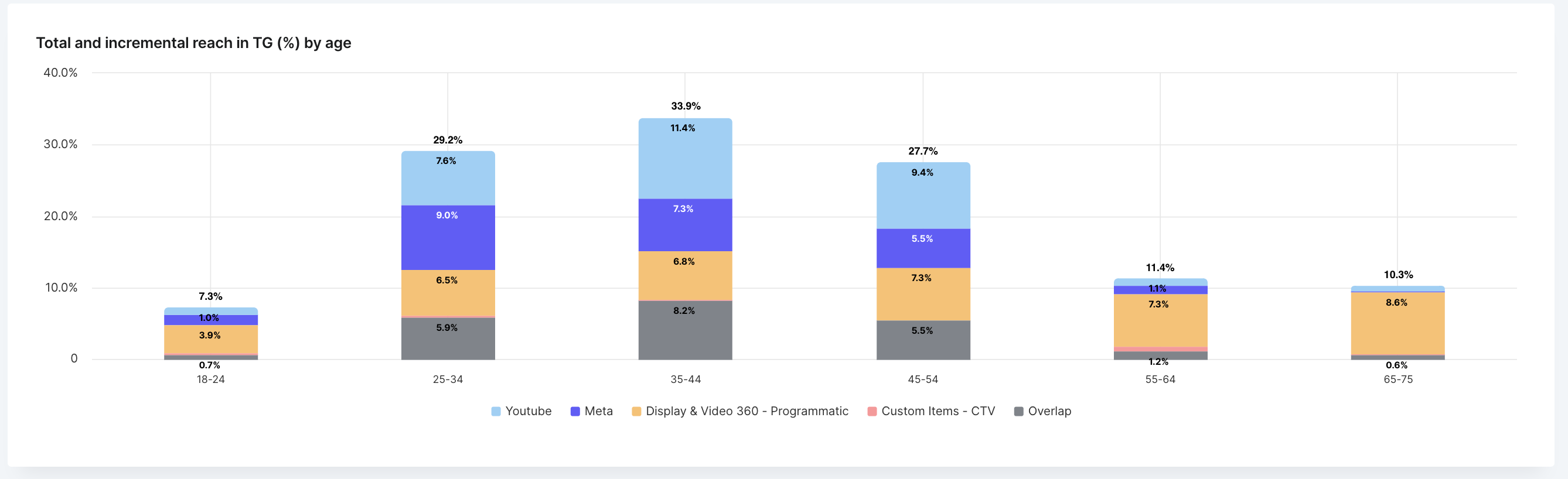
In addition to that, you can see a graph called Total and incremental reach in TG by age. It represents the total and incremental reach for the following age brackets: 16-25, 26-35, 36-45, 46-55, 56-65, 66-75, 75+
Please note:
- if you select Great Britain as a target country, the age brackets will start from 18.
- if the report includes a YouTube channel, the age brackets will be slightly different: 18-24, 25-34, 35-44, 45-54, 55-64, 65-75, 75+
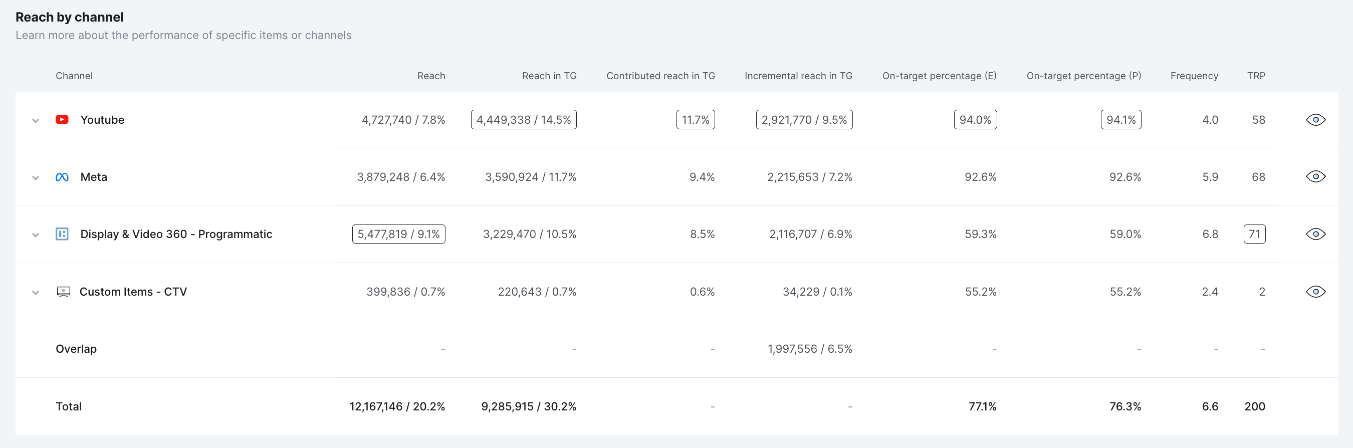
At the bottom of the Reach tab, you can find the Reach by channel table. Here you can find more info about the Reach performance of specific channels, reporting items, and subitems. You can expand the channel item to see the individual reporting items. Each line corresponds to a different reporting item, showing the different KPIs, e.g. 'Reach', ‘Reach in target group’, ’ Incremental reach in target group’, and others. Learn more about these reporting items here. Also, in the list of channels you can see the Overlap which shows the reach overlap between the channels.
FAQ
Why can I only add 3 channels to my Venn diagram?
It’s impossible to draw a Venn diagram with circles that will represent all the possible intersections of 4 (or more) channels. However, it’s possible to draw Venn diagrams with more than 3 media channels by using ellipses or rectangles, but these Venn diagrams lose their simplicity and can become complicated and difficult to understand. To maintain simplicity, we’ve decided to support 3 media channels only.
How are incremental reach and overlaps calculated?
To estimate incremental reach and overlaps, we apply the inclusion-exclusion principle, a fundamental technique in combinatorics, that offers a way to calculate the total number of elements in the union of multiple sets. This principle is useful when applied to audience measurement, where “sets” can be thought of as people reached on individual media channels (e.g., Meta, YouTube, Open Web, etc.).
- Single Media Channels as Sets
To apply the inclusion-exclusion principle, we consider each media channel as a set, where the elements are the reached audiences. The size of the set represents the total reached audiences for that channel.
- Total Reach on Media Channels and Campaign-level
Using our measurement methodology, we can estimate the total reach on each media channel as well as the campaign.
- Calculating Incremental Reach
Using the concept of "complementary reach", we can calculate the incremental reach of each channel. The complementary reach is the total reach of each media channel except the one we want to measure. Incremental reach for each channel is then given by the total reach (all channels) minus the complementary reach (i.e. all other channels).
- Calculating Overlap
Knowing the total reach on each media channel as well as the campaign, we can accurately calculate and account for individuals who get exposed across multiple channels. By applying the inclusion-exclusion principle, we calculate all individual parts of the Venn diagram.
Illustrative Example
Imagine a campaign with two media channels: Meta and YouTube. Each has its own reach, but there are individuals who have been exposed on both channels (i.e., the overlap).
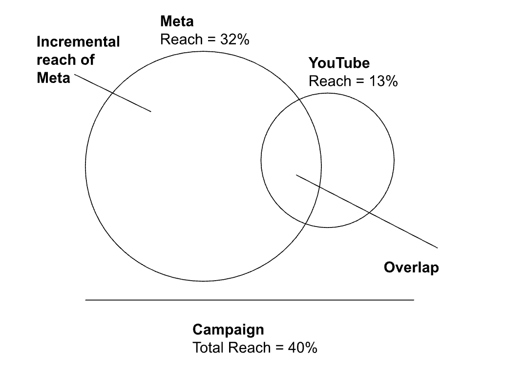
By applying the inclusion-exclusion principle, we can determine the incremental reach and the overlap between the two channels.
Overlap(Meta, YouTube) = Reach(YouTube) + Reach(Meta) - Total Reach(Meta, YouTube)
Incremental reach(Meta) =Total Reach(Meta, Youtube) - Reach(YouTube)
By entering the numbers into the equations, the following results are derived:
Overlap(Meta, YouTube) = 13% + 32% - 40% = 5%
Incremental reach(Meta)= 40% - 13% = 27%
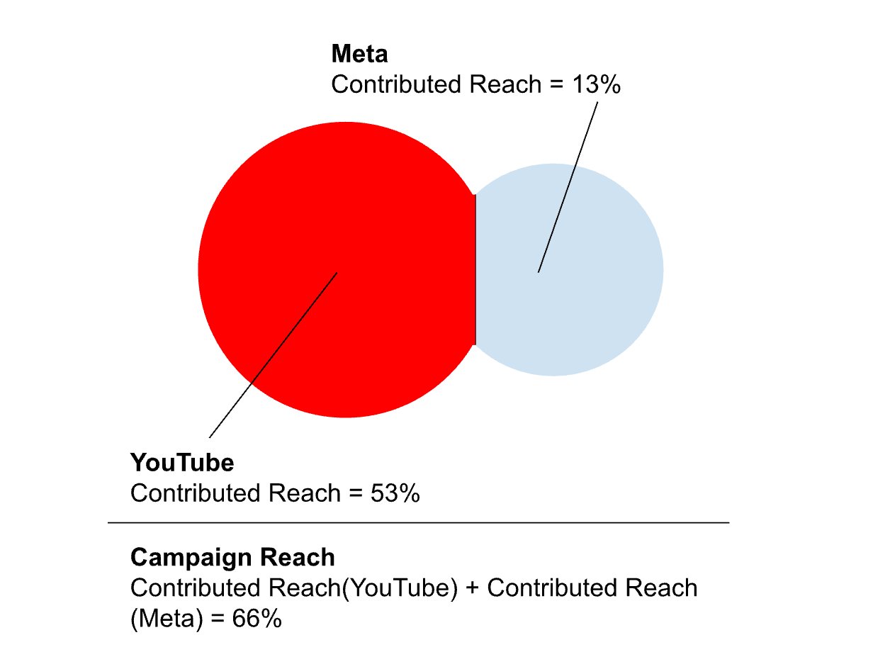
What’s the difference between incremental reach and contributed reach?
Incremental reach refers to the additional audiences (i.e., unique reach) that a specific media channel or campaign element brings to the overall campaign that would not have been reached by other channels. For example, if a campaign is running on both YouTube and Meta, the incremental reach of YouTube would be the portion of the audience that YouTube reaches but Meta does not.
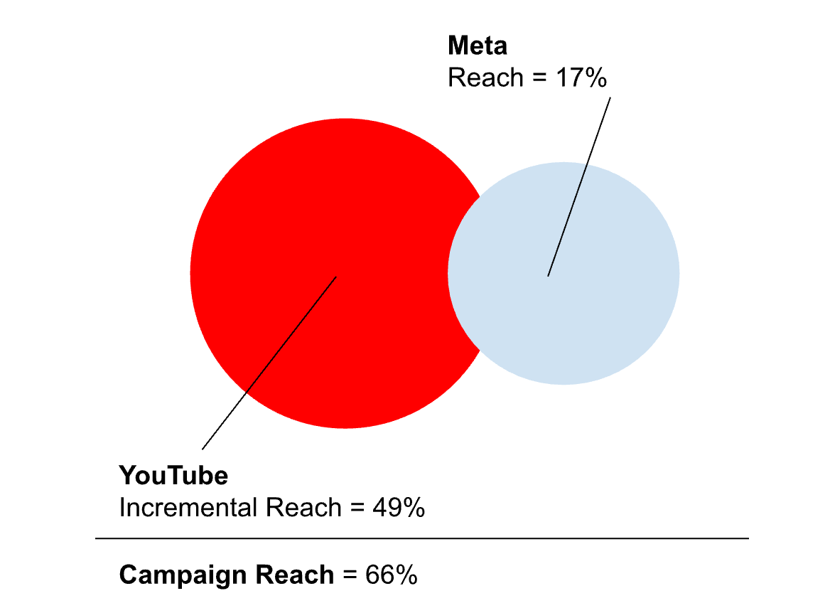
Contributed reach, on the other hand, is the portion of the total campaign reach that can be attributed to a specific channel, considering the audiences it brings. It measures the effectiveness of a channel in contributing to the overall reach of a campaign, regardless of overlaps with other channels. For example, if a campaign uses YouTube and Meta, the contributed reach of Meta would be the percentage points of the total campaign reach that is attributed solely to Meta. The sum of contributed reach of each channel will be equal to the total campaign reach.
Why is incremental reach only available for media channels and not individual items or ad sets?
Calculating incremental reach at the level of individual items or ad sets presents a challenge due to the granularity and complexity of the data required, and is currently not supported.
Why is the Venn diagram clustering all Open Web channels?
This is caused due to the way we organize Open Web channels. If you have a keen interest in CTV, we recommend a workaround. By rerunning reports with a specific focus - excluding other Open Web channels - you can isolate the performance of CTV or any other particular interest area. This approach allows Open Web data in the report to represent the channel of interest (e.g., CTV), facilitating a more focused comparison against other media channels like Meta, YouTube, Amazon, etc. While this method doesn't provide the item-level incremental reach data within a media channel, it offers a strategic view of how each main channel, or a specific segment of a channel, contributes to reaching new audiences.
If you have questions in relation to understanding your reports, feel free to reach out to us at support@audiencereport.com.